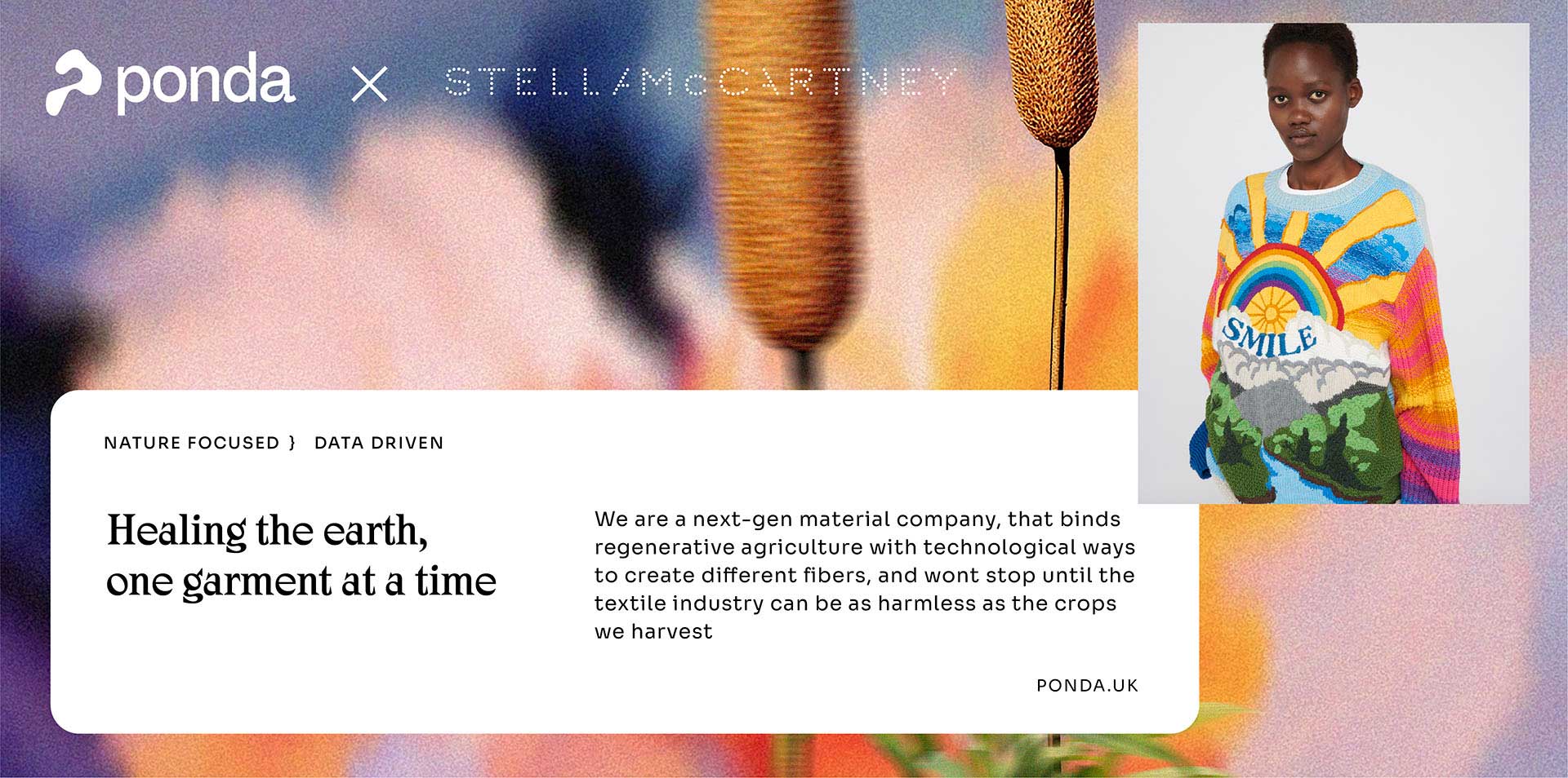
Ponda is a biomaterials company working at the intersection of regenerative agriculture and sustainable fashion, developing natural fibers sourced from wetlands and aquatic vegetation as an alternative to conventional textiles.

Ponda
The Context
When they came to us, they had a direction but not a brand. Our work spanned naming, brand strategy, visual identity, and web design, building from the ground up a presence that could carry the weight of what they're actually doing. They needed a brand that could hold both sides of what they are, the scientific and the elemental, the industrial and the natural.
The Approach
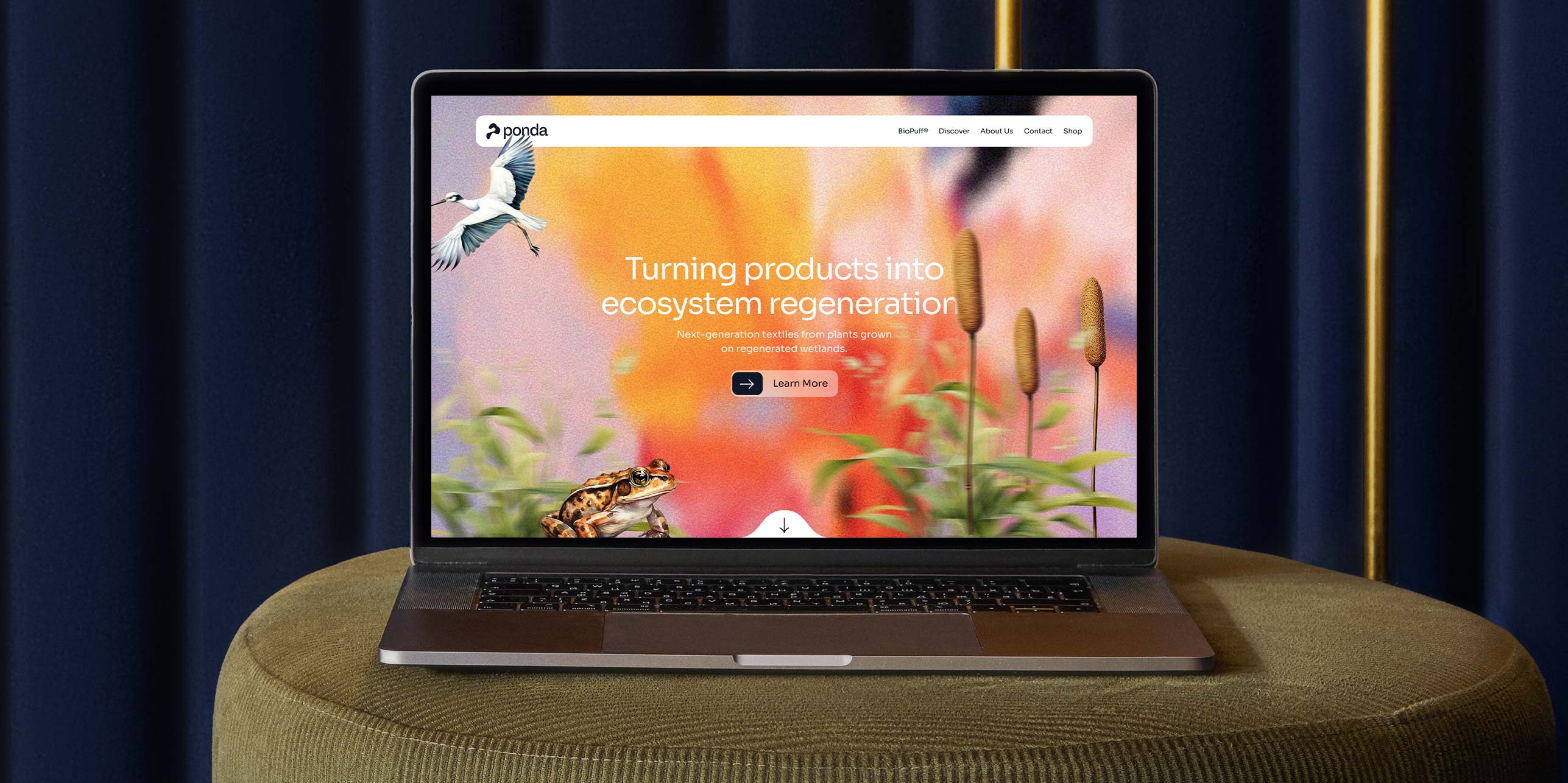
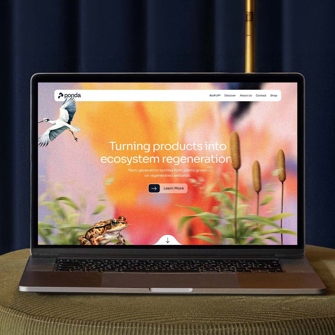
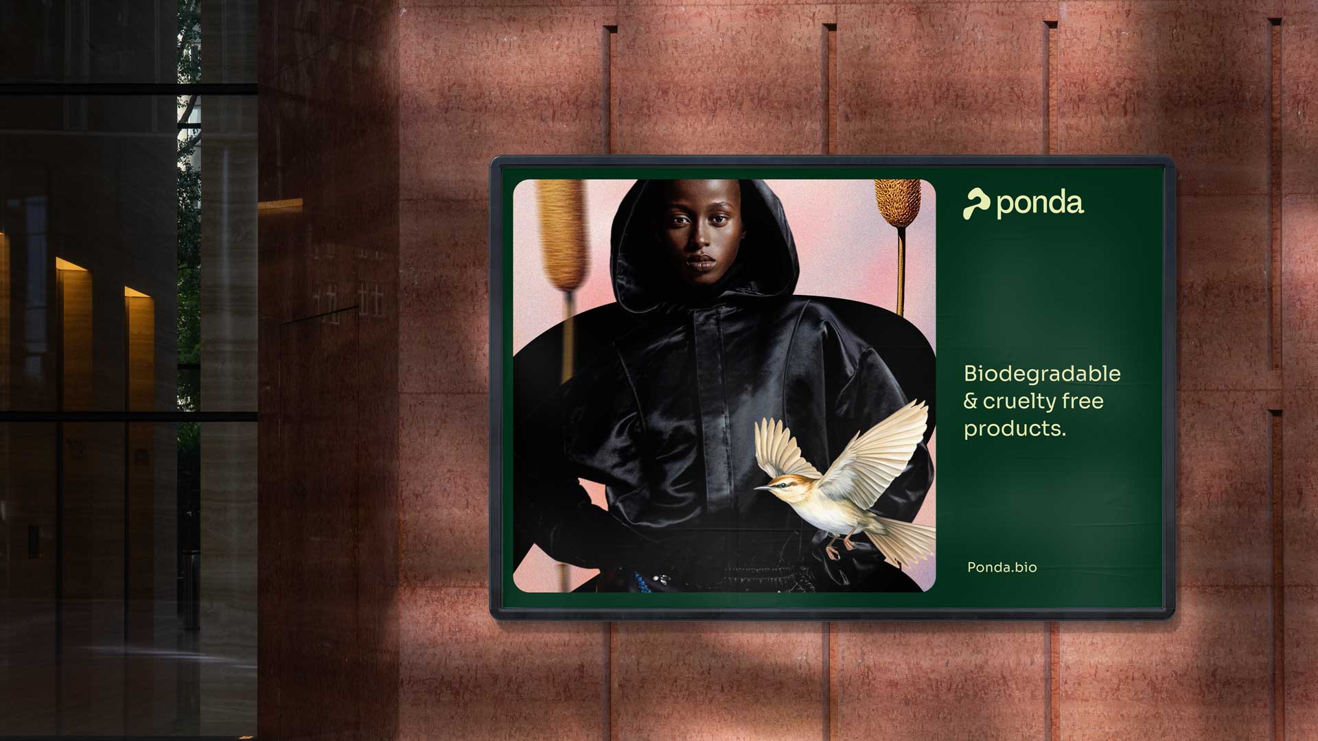
We started with the name. Ponda emerged from the word of "ponds", a word that feels rooted, alive, and precise. From there, we built every element of the brand around a single tension: science, research and nature, held together. The logomark draws a sinuous letter P that traces the aerial geometry of a wetland, organic in form, deliberate in meaning.
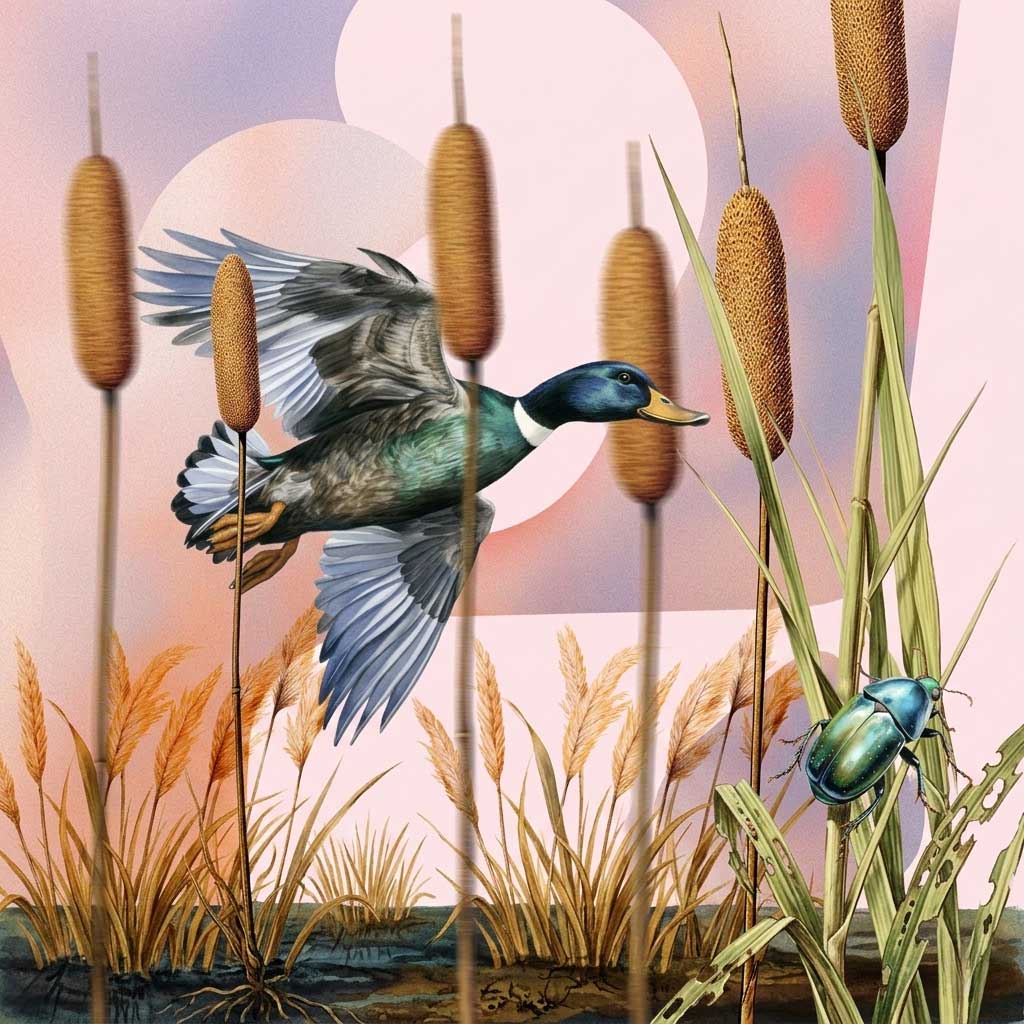
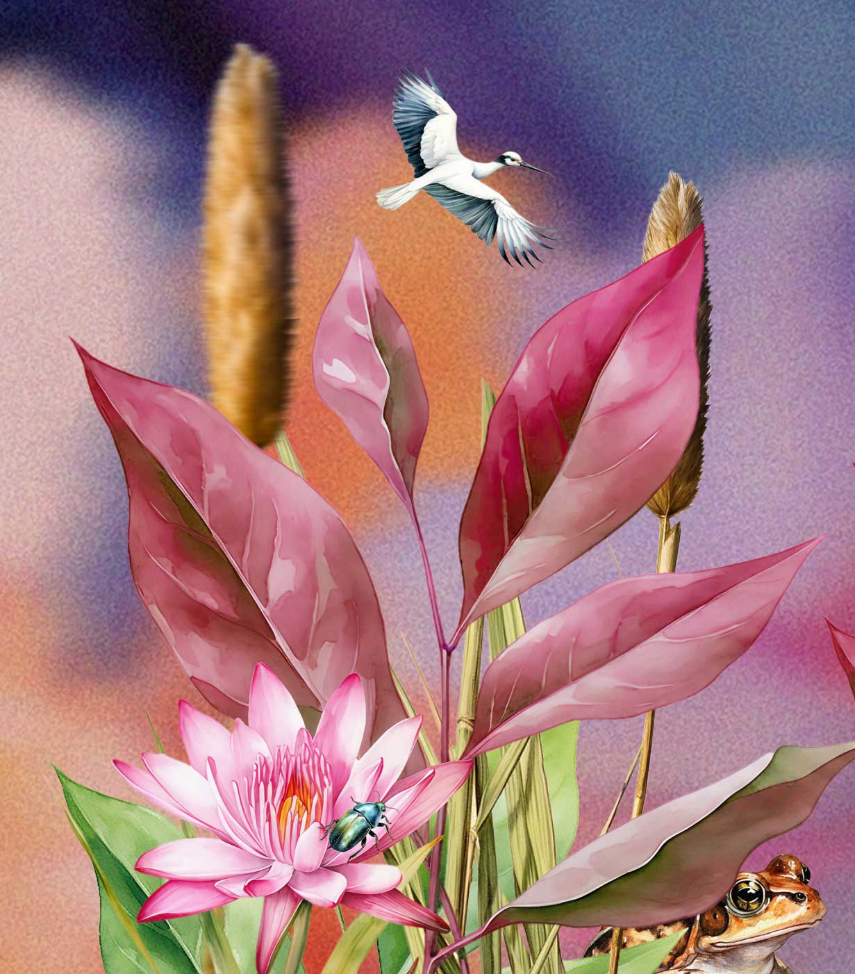
To extend the brand's visual language, we developed an illustration system inspired by the analytical precision of botanical encyclopedias, detailed, warm, and grounded in nature. Each illustration treats wetland flora and fauna as subjects worthy of close study, reinforcing Ponda's commitment to ecological depth over surface-level aesthetics.
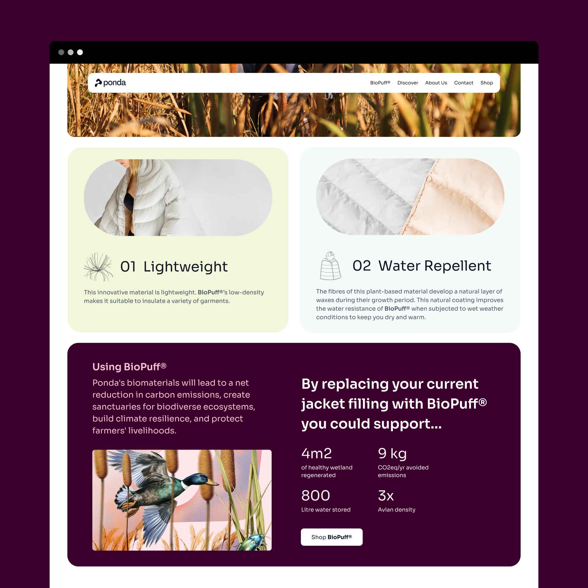
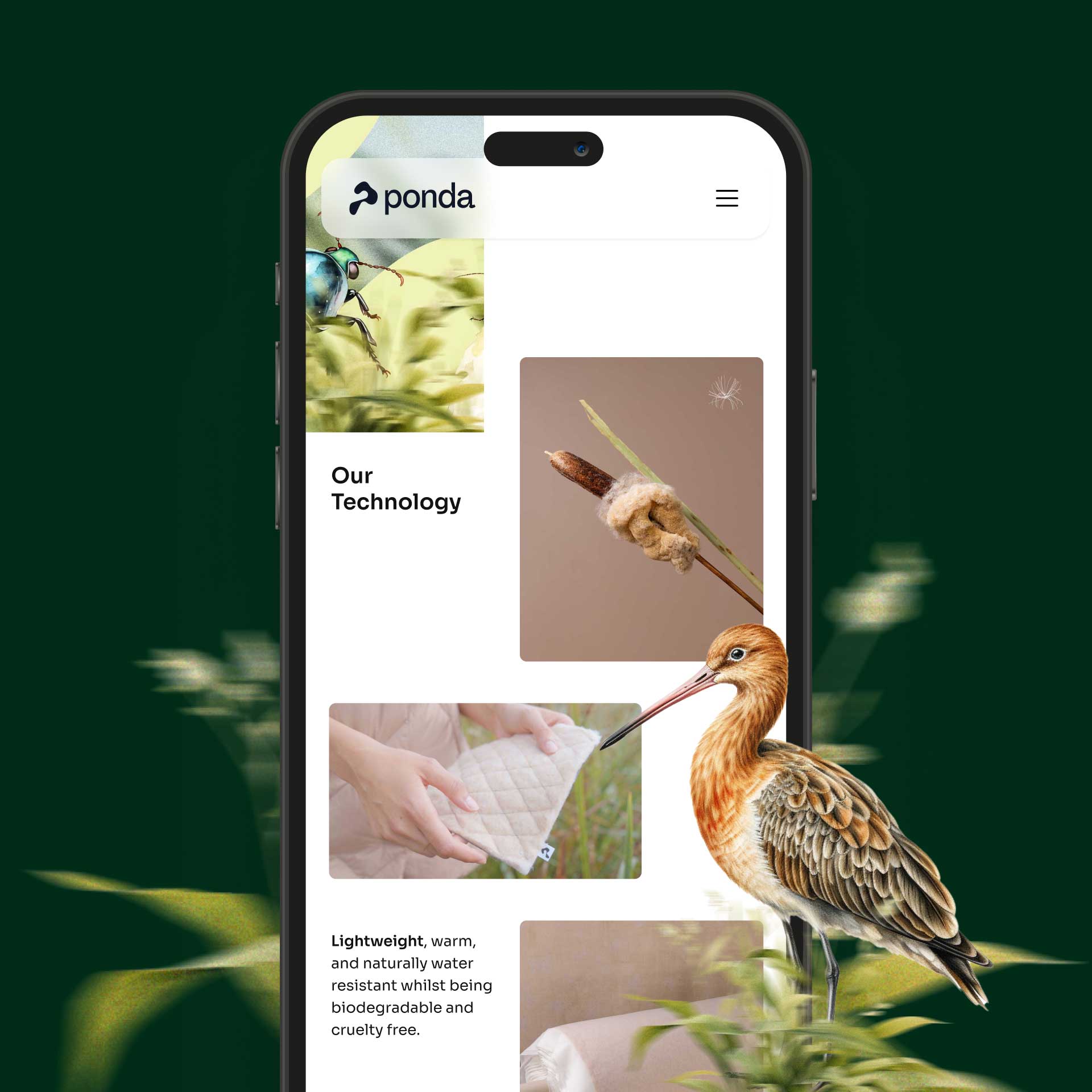
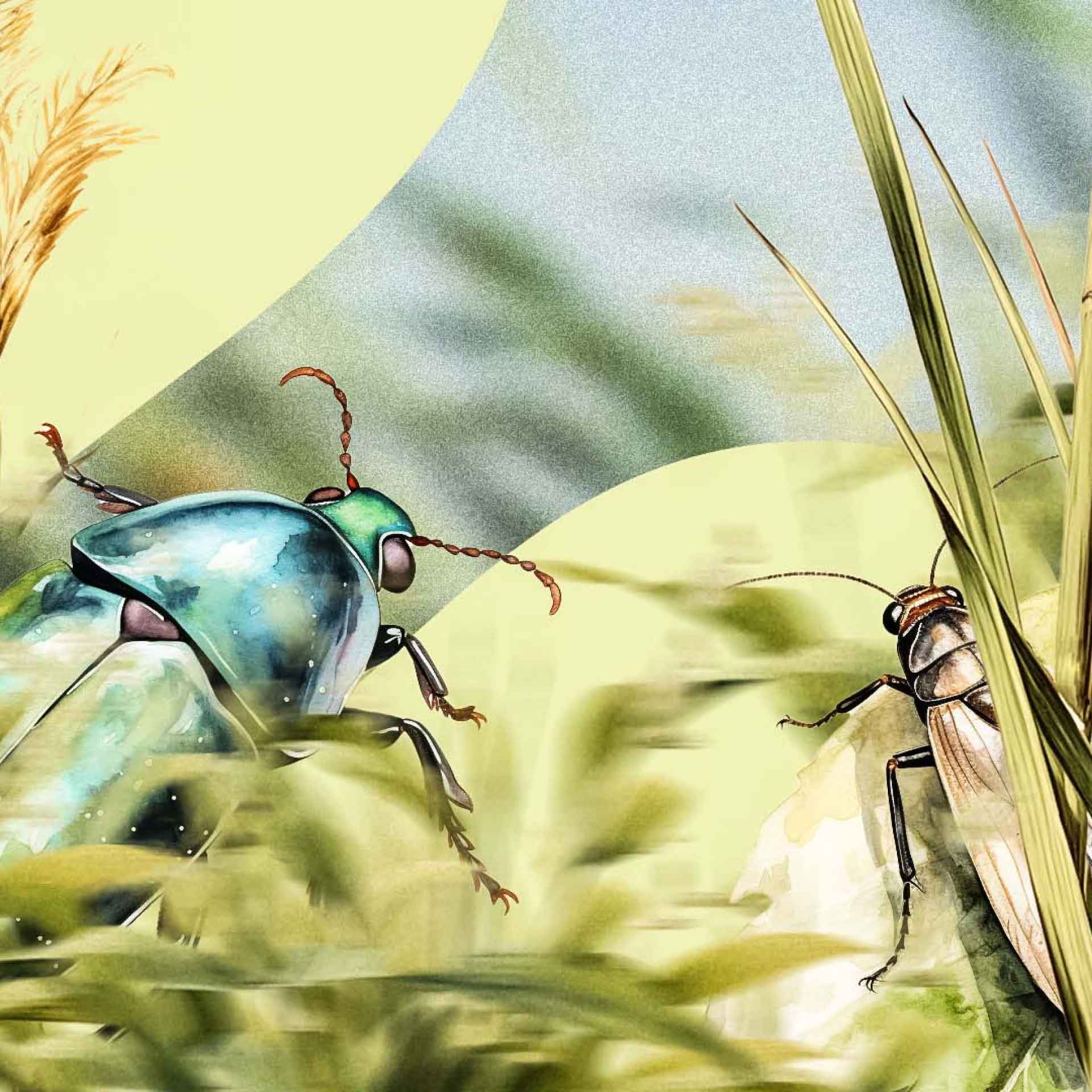
We used AI to define and codify the graphic style, delivering Ponda a scalable illustration system built on clear, structured prompts, giving their team the tools to grow the visual identity without losing consistency.


Credits
Brand Strategy
Josefina Cox
Creative Direction
juan pablo lópez
Alan Eaglehurst
Not sure where to start?
Book a call or reach out on WhatsApp. No pitch, just an honest conversation.


"Lorem ipsum dolor sit amet, consectetur adipiscing elit. Suspendisse varius enim in eros elementum tristique. Duis cursus, mi quis viverra ornare, eros dolor interdum nulla, ut commodo diam libero vitae erat."